

About this Project
A website that helps people transition to a healthy lifestyle holistically.
Overview
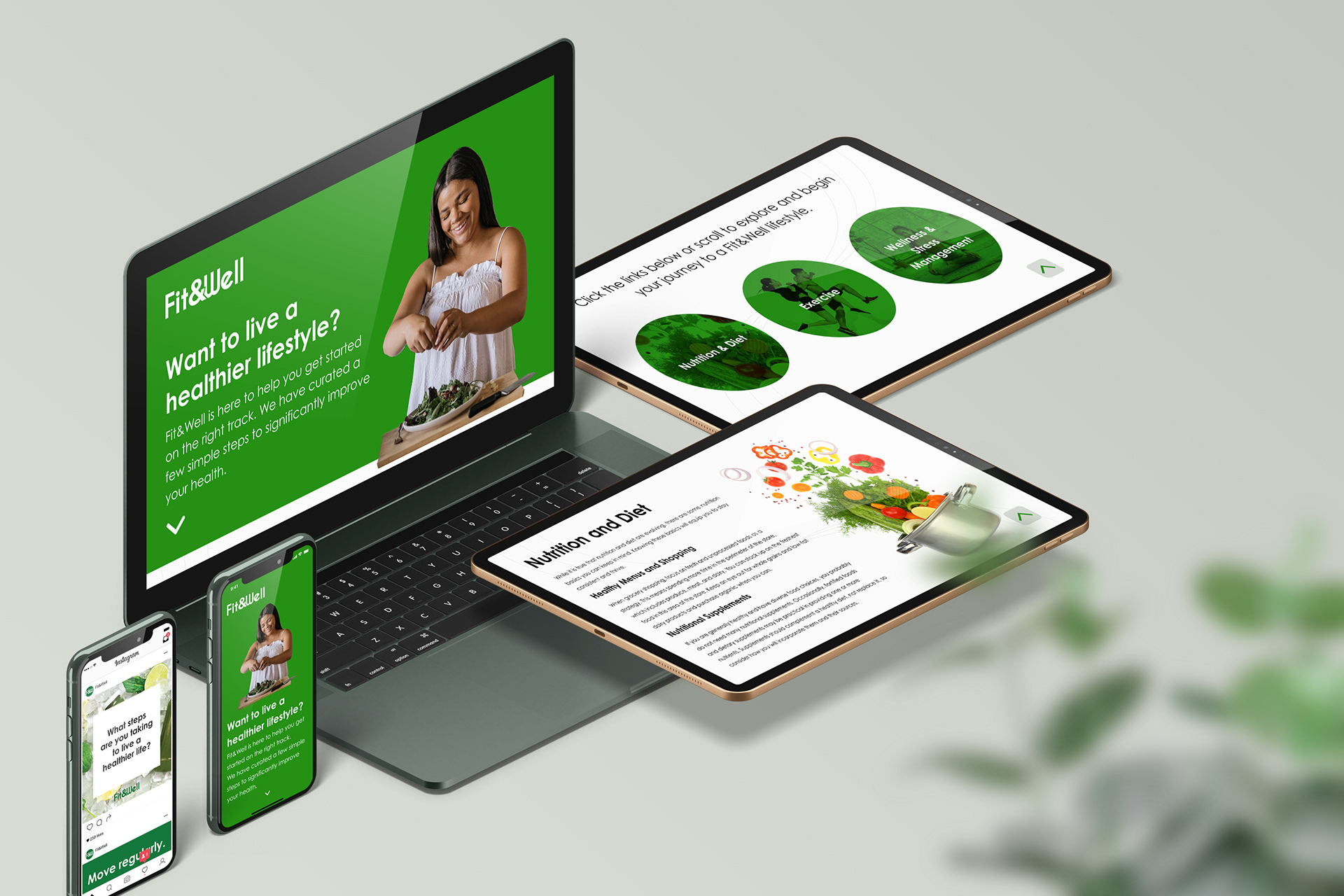
Fit & Well was created as a final assignment in my web design class. I decided to incorporate my interest in wellness and exercise into a website that could guide and encourage others to change their lifestyle. The website is broken up into 3 core sections: Nutrition, Exercise, and Stress Management. Based on research conducted online, these were the key areas people struggle with in their day-to-day lives. Making a change to one of these could completely change a person’s outlook on life, which was the goal.
Process
I wanted to create something that was easy to follow with seamless navigation through each section for visitors. I knew the website would be one page site based on the amount of content written, so I used the wireframes below to play with different layout options. The main persona used as a guide to create the flow of the site is listed below.
PERSONA 1
Background
- 20-40 years old
- 70% chance a female
- Employed Full-time
- Leads a busy life
- Eats fast food at least twice a week
- Wants to make a change to a healthy lifestyle, but isn’t sure they have the will power or the time
Needs
- They need something that gives them the basics of a healthy lifestyle
- They don’t have much time, so they need something that gets to the point quickly and is easy to navigate
- Tips are extremely helpful because it gives them something they can utilize immediately
Based on wireframes and the persona, I created a design that was clean and eye-catching. Green was used to translate wellness and health and the font chosen (Century Gothic) is easy to read online, had a sleek and modern look, and worked well as body text and headers.
Each section included a tip visitors could use immediately along with buttons that navigated to the top of the page and the previous section. The concept was to encourages visitors to incorporate each section into their lives as they scrolled. Because the visitors lead busy lifestyles, it was important for the website the have a responsive design that would display well on mobile and a desktop.
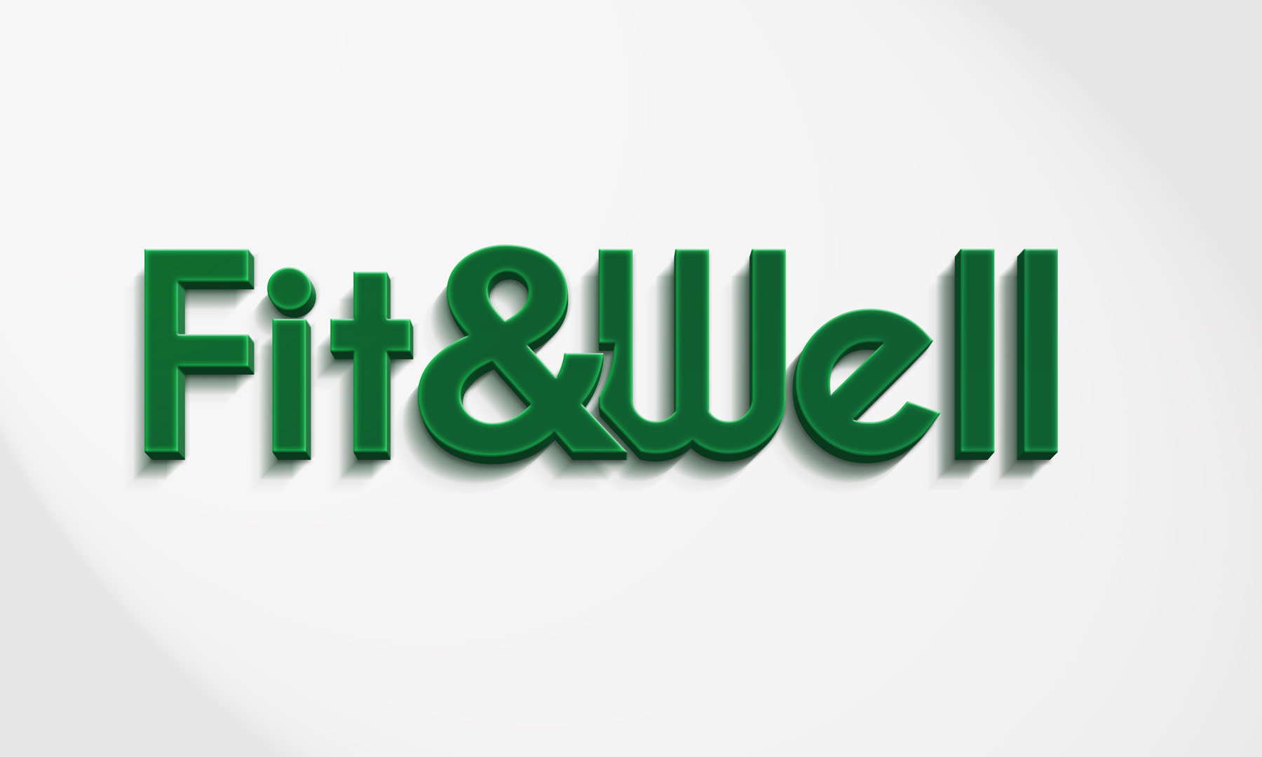
Logo
The goal was to create a logo that would complement the content and not distract from it. I used a slightly darker green from the green used for the website and created a text only logo that was bold enough stand alone, but submissive enough to complement a greater message.
The font used was similar to Century Gothic with slightly different nuances, such as the rotation of the ‘e’ and the difference in the design of the W. I wanted the word "Fit" and "Well" to appear as one so I used an ampersand to cut slightly into the ‘W’ of Well to show that we can’t focus on Fitness with out focusing on Wellness.
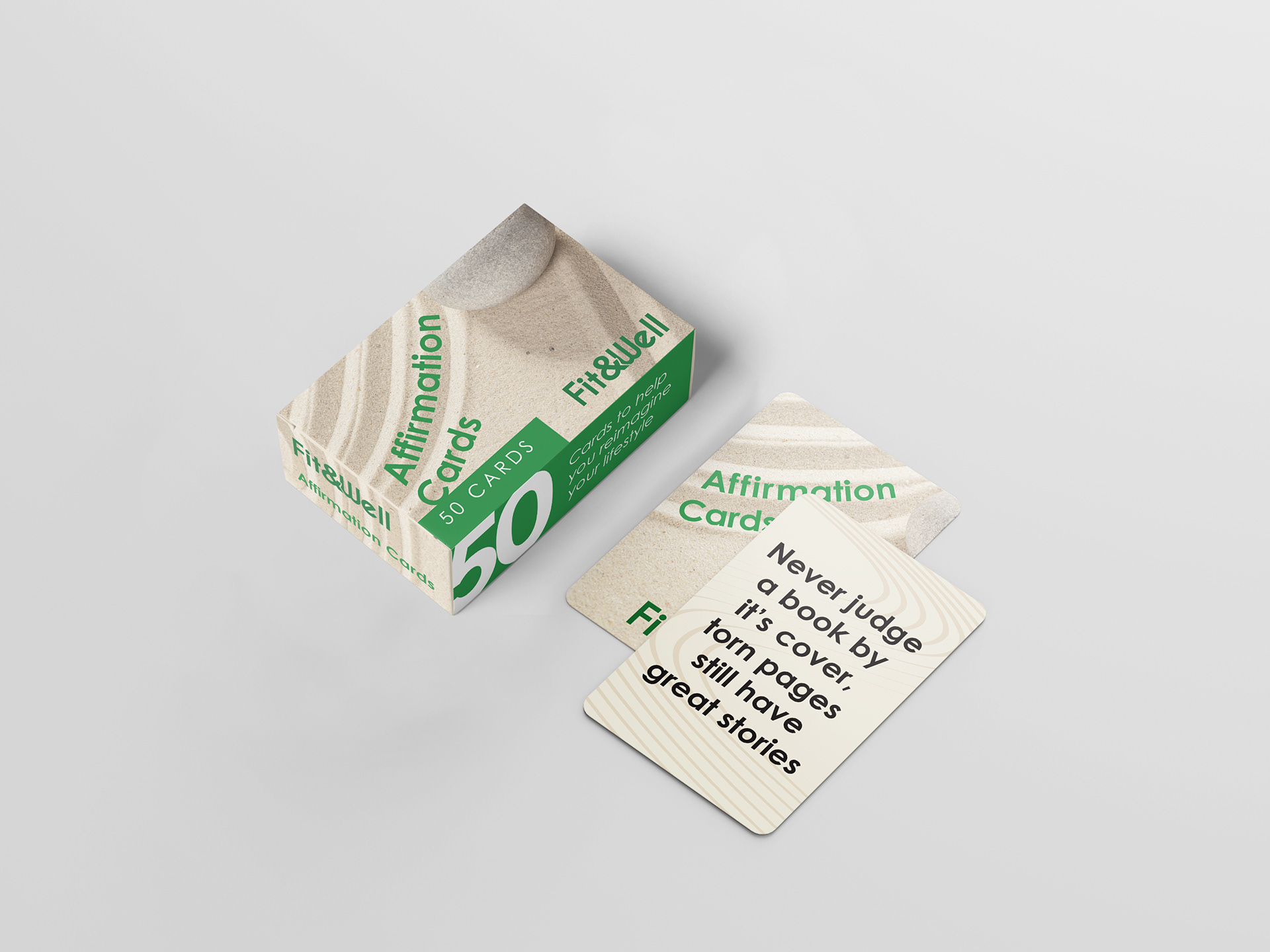
Branding Guidelines
Desktop Prototype
Mobile Prototype
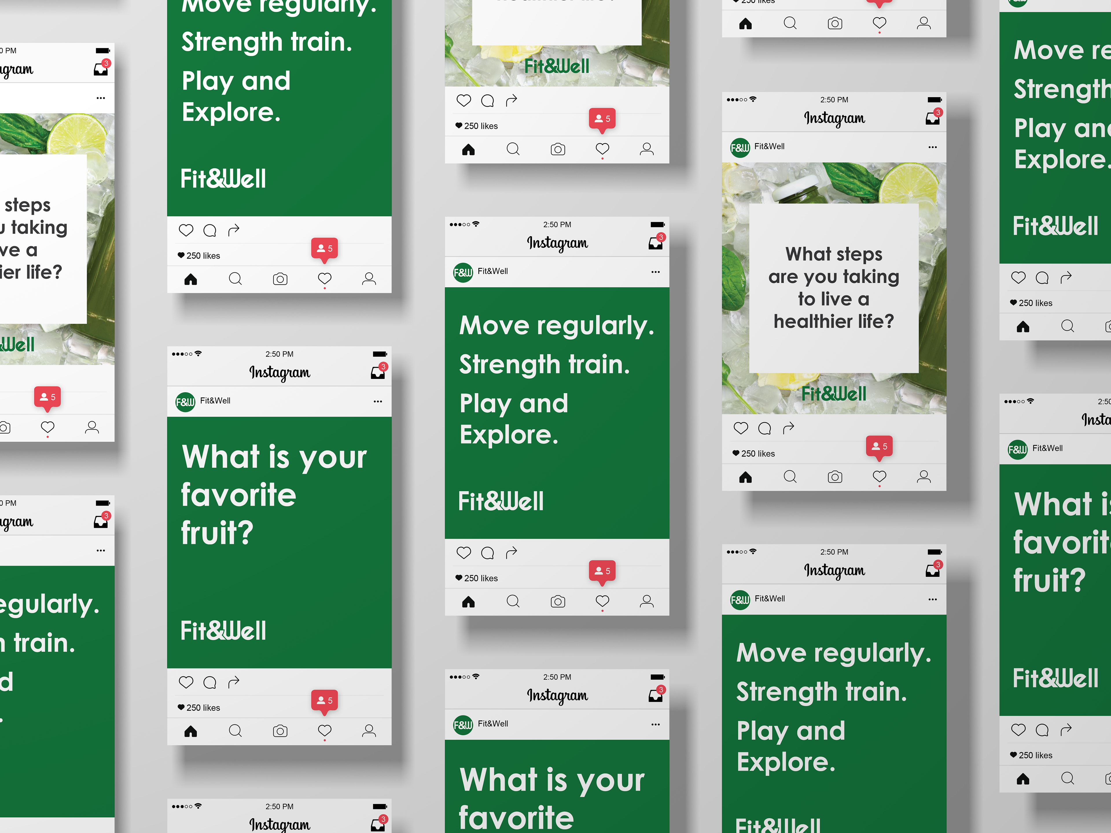
Instagram Posts