
About this Project
Packaging redesign to reflect the value and usefulness of the product.
Overview
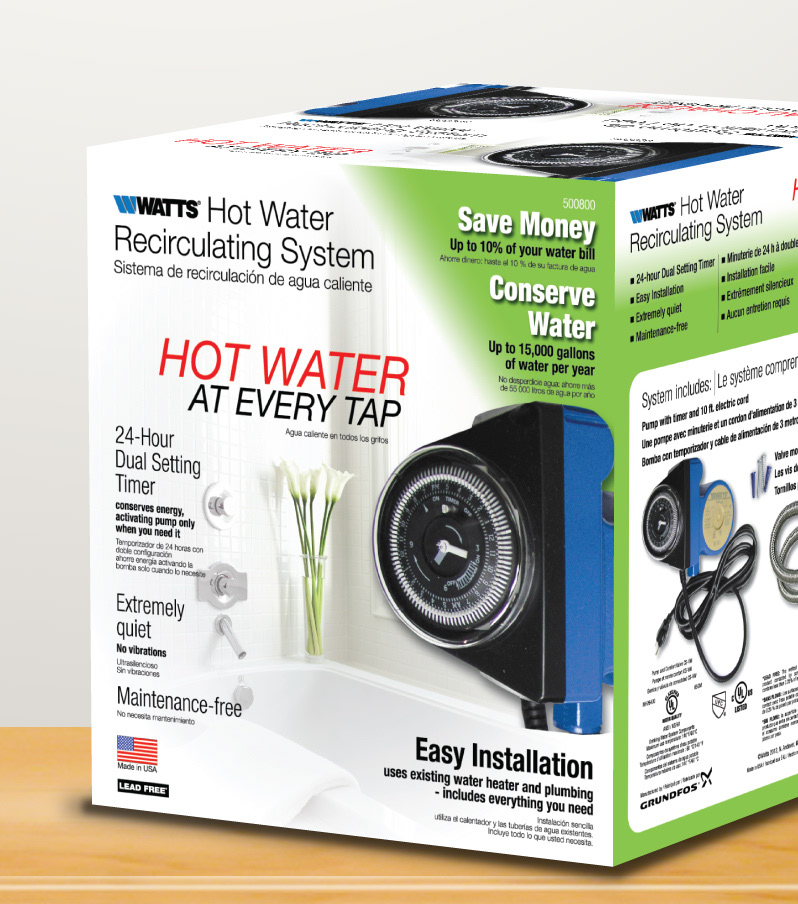
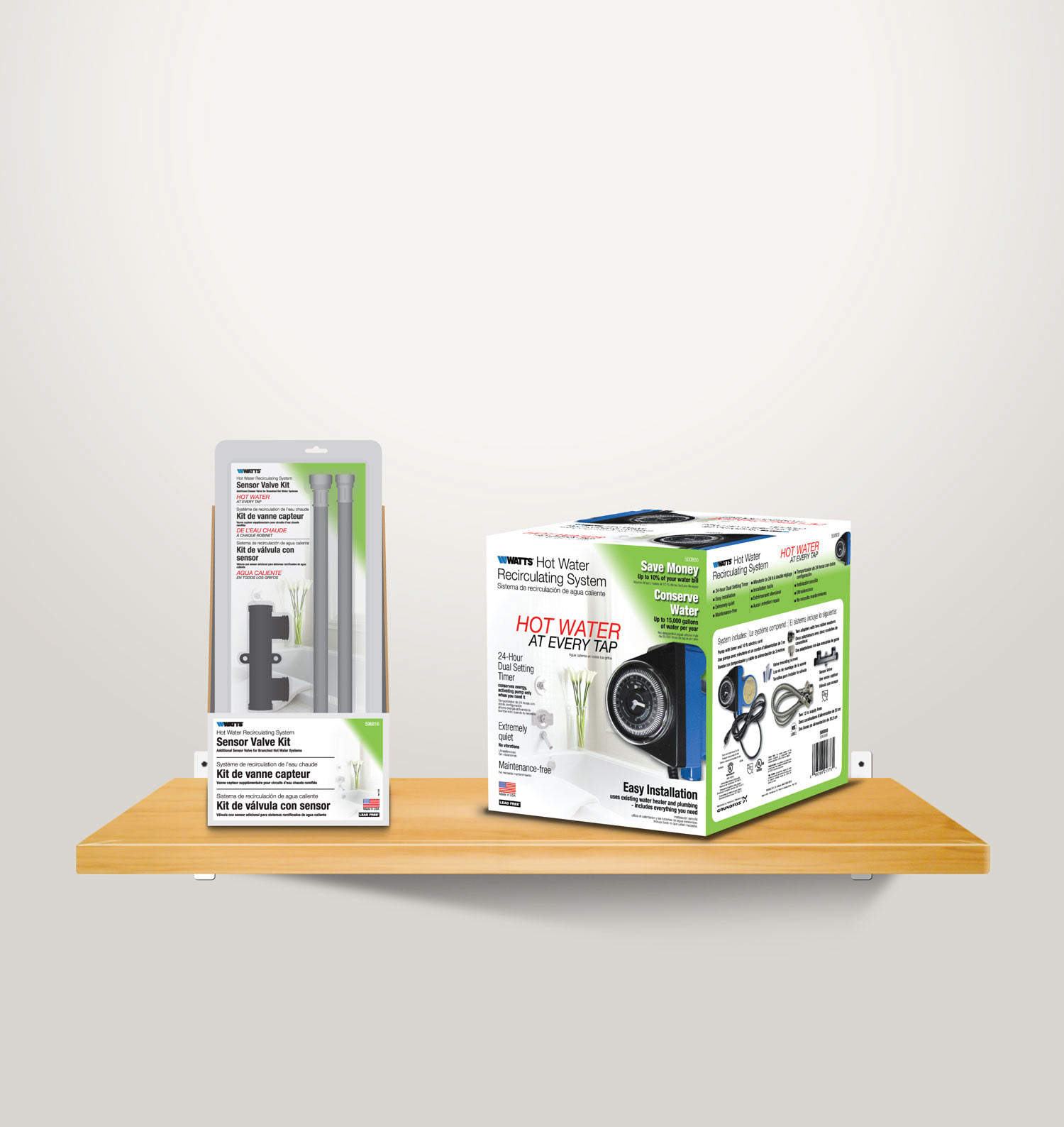
I was tasked with creating updated packaging while working at Watts Water that would reflect the value and usefulness of the product and appeal to female consumers. The previous packaging was dated, complex, and monotonous. I completed the projected over 6 weeks while juggling other projects. I collaborated with a co-worker to create the label design for the Sensor Kit.
Process
Watts Water researched with the retailer (Home Depot) and determined the primary consumers of the product were female DIYers. We wanted to create a design that had a clean and feminine look, but still highlighted the value of the product. We also had the challenge of creating a design that accommodated three different languages. To begin, I imagined the front of the box was a lifestyle magazine cover with a focal point of a timeless, elegant, and feminine photo that allowed an editorial layout to showcase the product's benefits. Using the editorial concept, I used the product name as the title, the product benefits as intriguing stories, and the tagline as the theme. Different weights and sizes of typography were used to highlight the important messages on the package and break up the content. I tackled the challenge of making the package trilingual by placing English and Spanish on the front and French on the back of the box. The color scheme was chosen to highlight the water conservation benefits, environmental benefits, and monetary savings gained on the consumer’s water bill. The pop of red was chosen for the tagline to simulate heat and facilitate readability on the packaging.